

Finding the Feel
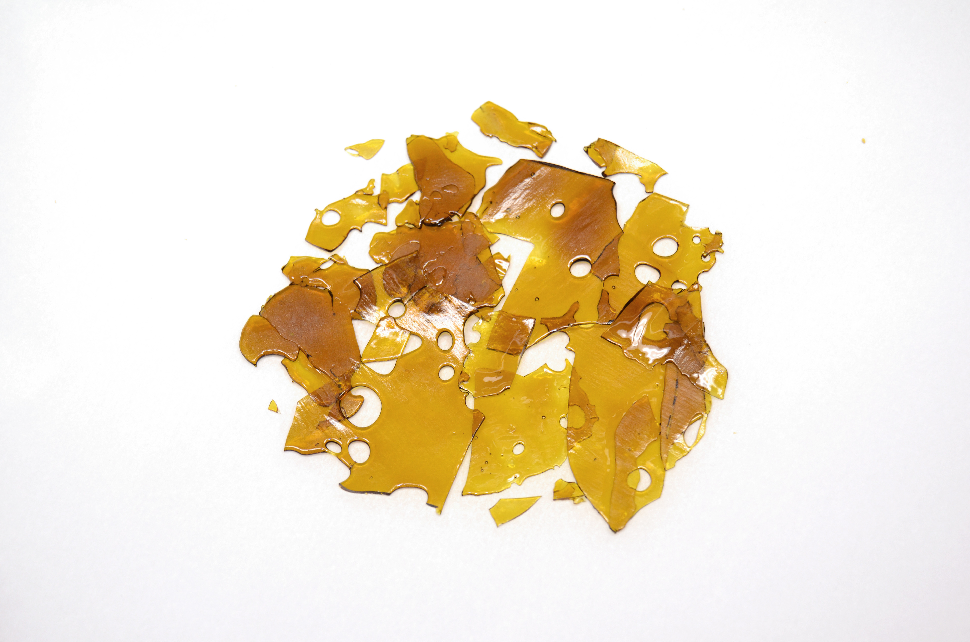
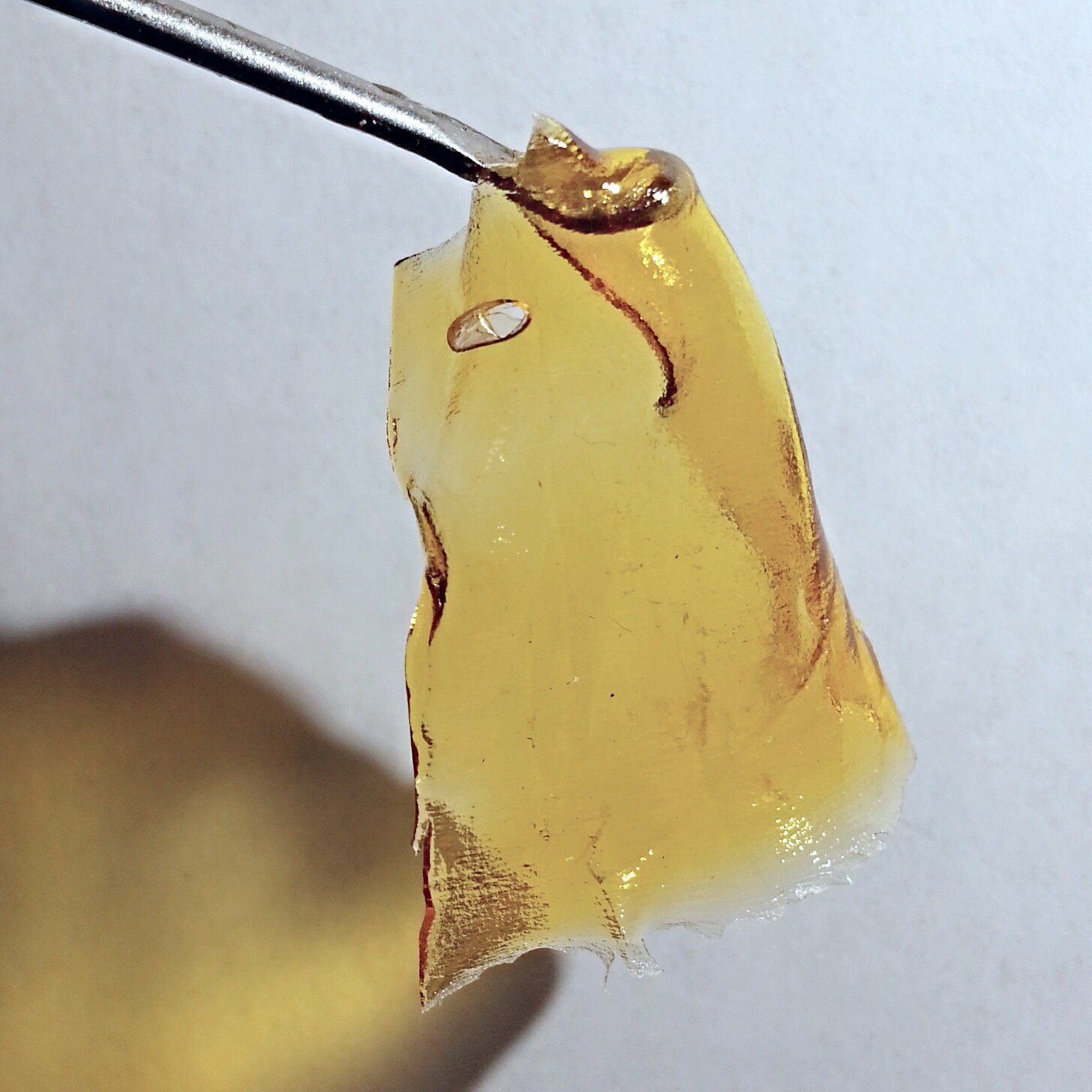
Something new for me. The product is a potent form of concentrated marijuana called "shatter." It's legal in British Columbia, Canada, where my client opened the first "marijuana shopping mall" in the world. The client manufactures shatter of different varieties for sale, and their newest product was to be called "Green Collar," marketed to working class enthusiasts with an affordable price and excellent quality. So Green Collar wanted to establish a working-class, blue collar aesthetic that would connect with their customers.


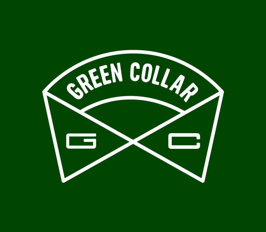
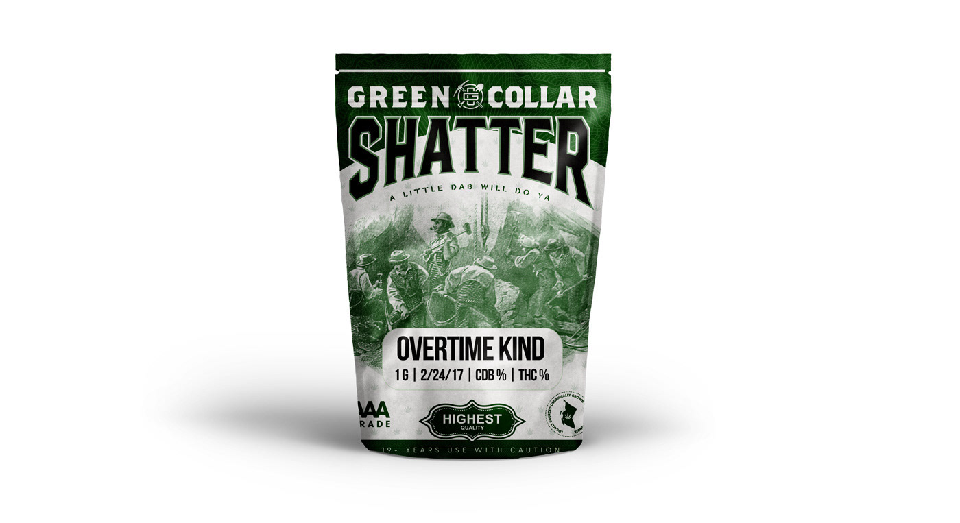
The product is geared toward working-class consumers, so my first concepts were heavily inspired by the age of blue collar unions and factories, the 1950s.
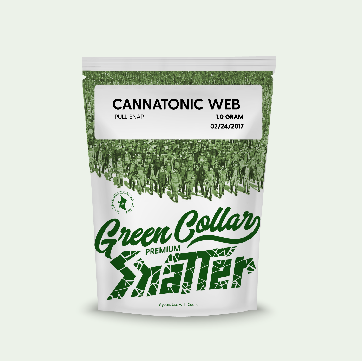
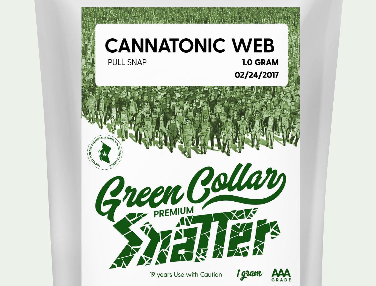
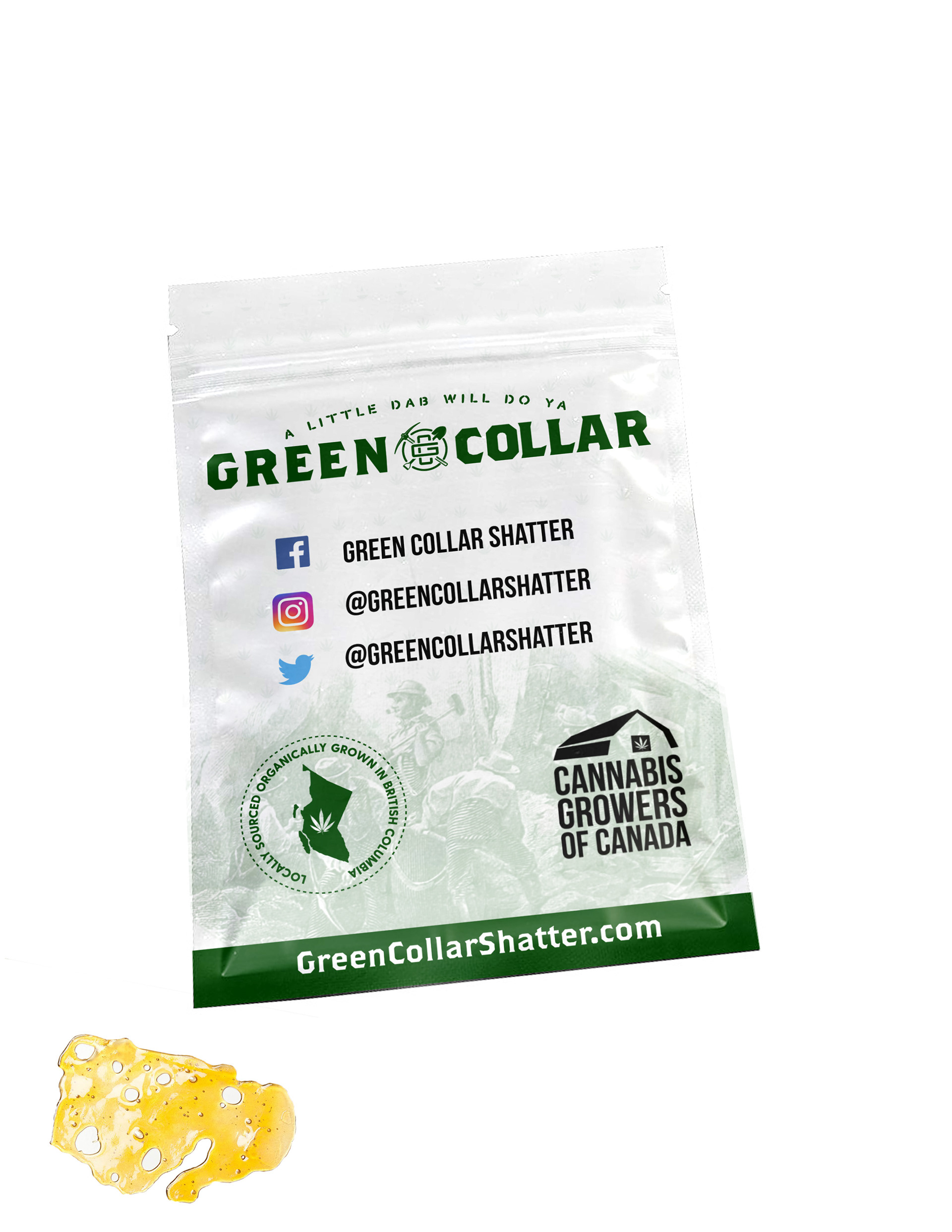
The package is a foil pouch. It took a few iterations to really land in the direction we wanted to eventually move. Eventually, other products like pre-rolled joints would be available as well, which use a cigarette package.
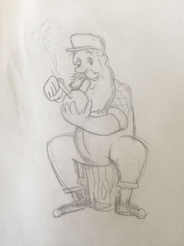
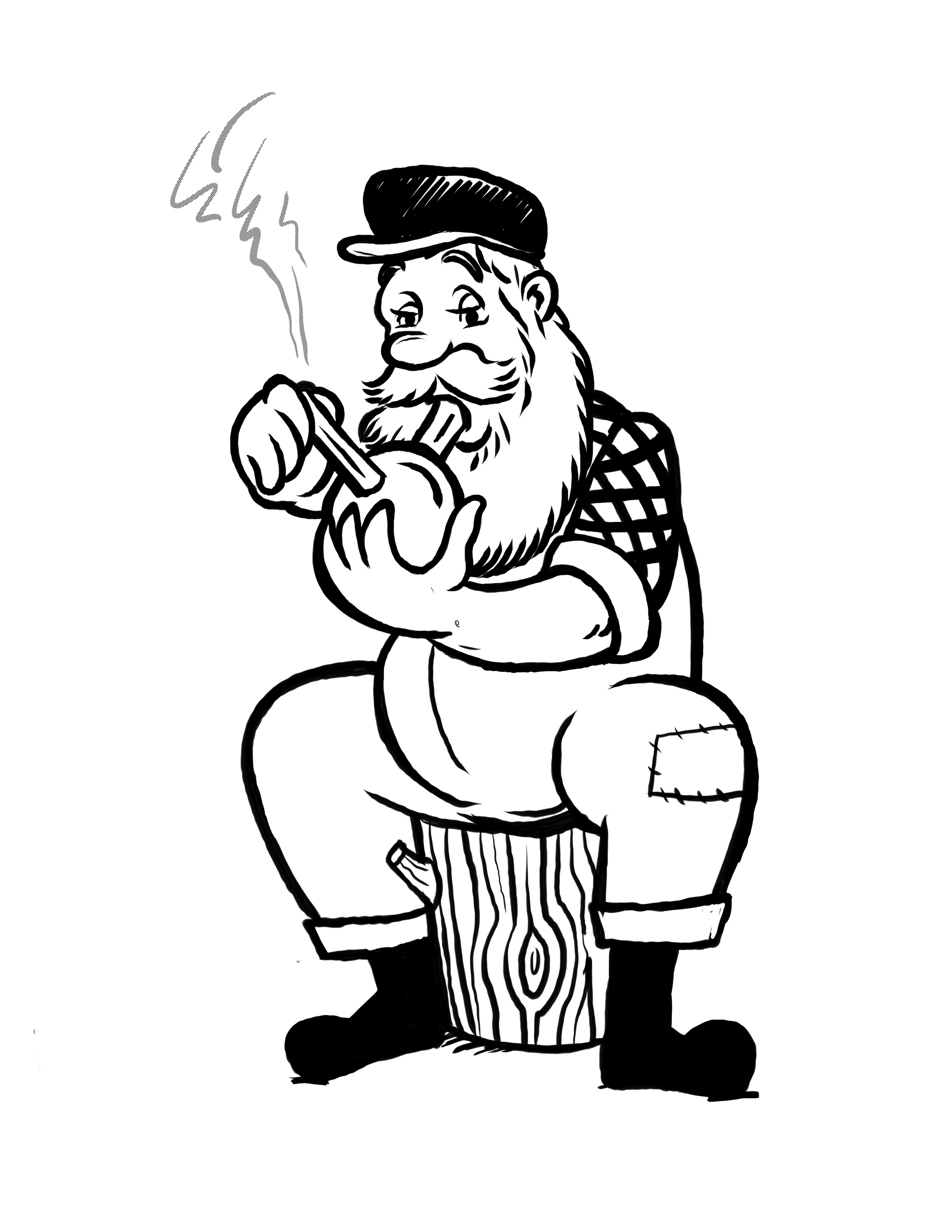

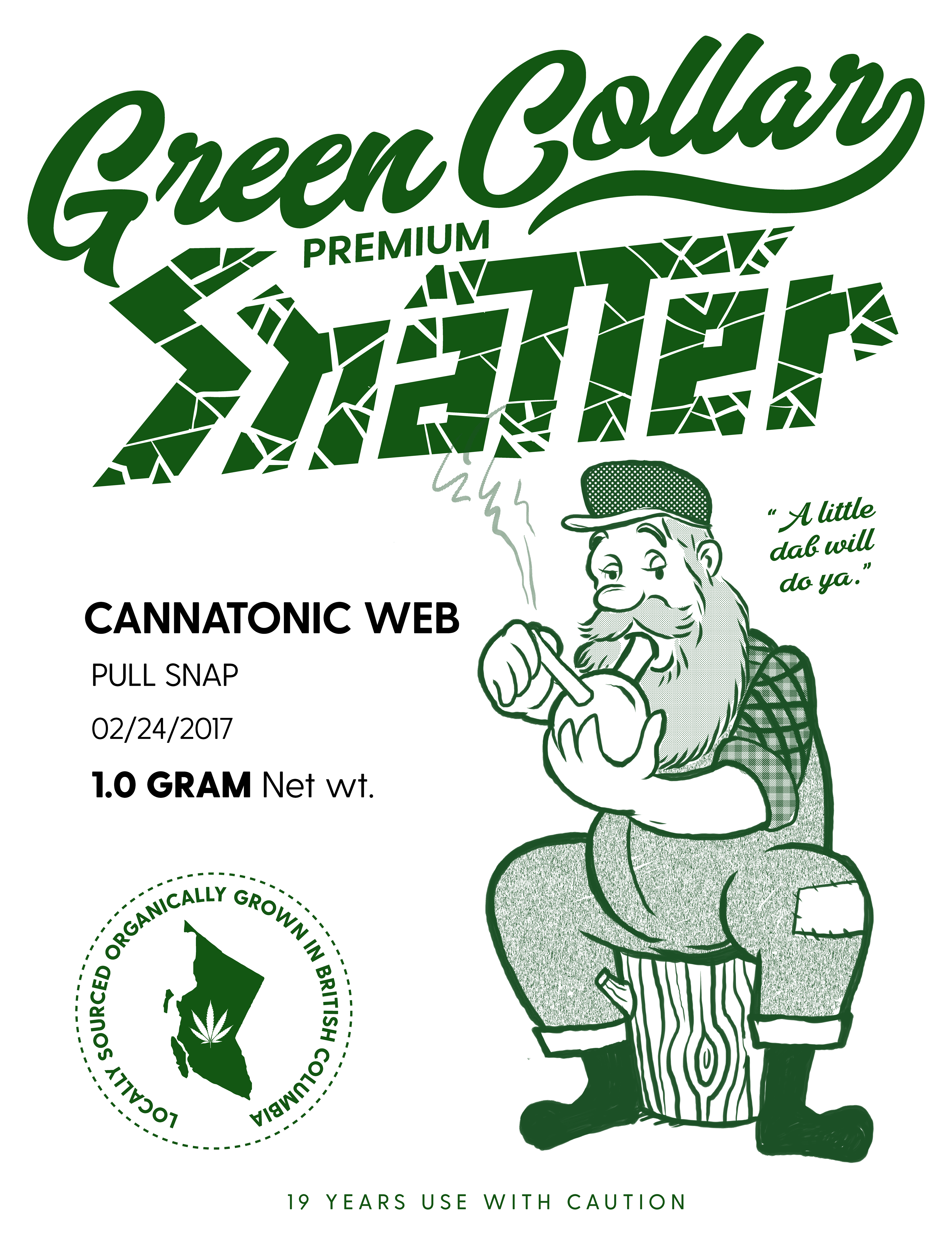
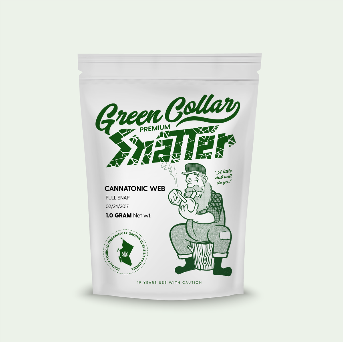
I always have loved vintage mascot design, so I had a run at it early on. We eventually landed with a design featuring miners instead of cartoon lumberjacks as the local industry has a storied history in mining. The finals feature a more conservative layout with a simple insignia piece to as the brand's anchor mark.


Let's work together on your package design project!
I can't wait to see what you're up to!
I can't wait to see what you're up to!